Saturday, May 16, 2009
Thursday, May 14, 2009
The animation and motion graphic unit gave me a good understanding of how to create animations by using a powerful program i.e Adobe after effect. Every week we were given step by step tutorials of how to do particular animation. The tutor helped us to
understand and learning by doing.
Futhermore, the lecture notes gave us the theory of animations which then can be applied to
practical wokrs. The best things in every lecture, Chris Denaro, the lecturer of this unit
showed us heaps of examples of animations from the professional artist as a guide for us as a student to develop our creativity towards doing our final project.
However, i still need help from any other resources to develop my creativity and learn more in order to develop sophisticated animation.
One of the best website i really like and help me much in achieving a certain technique is
http://www.videocopilot.com/.
This website owned by Andrew. He provides many video tutorials which are absolutely free.
Throughout my progress doing all the tutorial exercises, the difficult part was how to get idea to design things into the compositions. These include colour, forms such as lines and shapes as well as the visual styles. So I always get inspired from the existing animations which are available in the Youtube and it supports my learning process.
Mastering color therefore is the important aspect in any designed because it influences the mood of audiences. I learn this from the recommended reading from QUT blackboard. Color also has cultural differences in terms of its meaning. E.g Red means anger in japan but it might have a different meaning in any other countries.Lines and shapes also have their own meaning in term of visual communications. For instance, horizontal lines indicates stability, diagonal lines refers to as dynamic and vertical lines is instable.
All these creativity i have learnt in this unit and it is a new experienced for me...
Overall, animation and motion Graphic is the best.. :)
In this week tutorial (week 10), i learnt how to make audio driven animation by using Expression. First convert any audio into keyframe to allow any other properties such as scale and opacity applied onto it to make animation which follows the amplitude of the audio itself. From this video, i mask the drum object and applied the scale properties onto the audio amplitude layer. This is a quick way to make audio driven animation instead of adding key frame by frame which will be time consuming...The video above is just a simple one since i did this in the tutorial class... By the way, its quite interesting to learn this exercise... Have Fun....
Reference:Audio taken from creative common :
http://beemp3.com/download.php?file=3354523&song=11.+Tito+El+Bambino+-+En+La+Disco
Picture of drum:
http://www.global-b2b-network.com/direct/dbimage/50332566/Jazz_Drum.jpg
Wednesday, May 6, 2009
Excercise 1: MoodBoard


Exercise 2: Rotoscoping Video (Adding some video into my motion graphic)
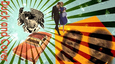
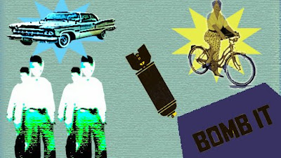
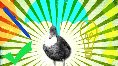
From tutorial week 9 exercise, we learnt about creating a moodboard and Rotoscoping video. The colour of the moodboard is based on the intrinsic colour relationship in a dintinctive image from 1970s. Through my own research of colors used in 1970s which had been displayed in posters and magazines at that time, the colour used was Navy blue or dark blue, yellow, green and orange. I use retro color to represent this video and moodboard. From the recommended reading on the QUT blackboard in one of the articles about colour, it says "color act as lighting which can influence the emotions and moods of the viewers"... They also used particular forms such as line and shapes in compositions. There were many posters using lines that radiates outwards from the centre which indirectly gives a sense of retro and using rounded and sharp-edge shaped as their styles..Therefore i used all these ideas to create and publish my own video, blending them to give 1970s moods/themes...To support these, i used some images include the classic-typed people (identify through their old-fashion hair style) and old-designed bicycle and car to give the audience the feeling back to 1970s. The title of my video work is "Duck and Cover". It emphasized and reinforced audience in 1970s at that time to duck and cover whenever they encountered nearby bomb explosion for their protection.
For video rotoscope as part of this exercise, i have include a body of a person walking and then as he realized there was a bomb explosion, he began to duck(look at my moodboard image 2 . Through the tutorial given by our tutor, i have managed to mask the wanted part successfully. However, when you look at my video closely(related to second moodboard image), i didn't mask it properly where it has jagged around it. One more part that i forgot to add onto my video is the grainy effect or black and white as a style which can possibly identified by the audience as 1970s...I just realized this as i gained more experienced and more experiment using After Effect...as this is part of learning process towards doing my major project for assessment 3, its quite interesting to learn rotoscopic effect and as i gain more knowledge, now managed to point out area that i went wrong during my tutorial exercise in establishing the intended mood and themes to audience.


