Saturday, May 16, 2009
Thursday, May 14, 2009
The animation and motion graphic unit gave me a good understanding of how to create animations by using a powerful program i.e Adobe after effect. Every week we were given step by step tutorials of how to do particular animation. The tutor helped us to
understand and learning by doing.
Futhermore, the lecture notes gave us the theory of animations which then can be applied to
practical wokrs. The best things in every lecture, Chris Denaro, the lecturer of this unit
showed us heaps of examples of animations from the professional artist as a guide for us as a student to develop our creativity towards doing our final project.
However, i still need help from any other resources to develop my creativity and learn more in order to develop sophisticated animation.
One of the best website i really like and help me much in achieving a certain technique is
http://www.videocopilot.com/.
This website owned by Andrew. He provides many video tutorials which are absolutely free.
Throughout my progress doing all the tutorial exercises, the difficult part was how to get idea to design things into the compositions. These include colour, forms such as lines and shapes as well as the visual styles. So I always get inspired from the existing animations which are available in the Youtube and it supports my learning process.
Mastering color therefore is the important aspect in any designed because it influences the mood of audiences. I learn this from the recommended reading from QUT blackboard. Color also has cultural differences in terms of its meaning. E.g Red means anger in japan but it might have a different meaning in any other countries.Lines and shapes also have their own meaning in term of visual communications. For instance, horizontal lines indicates stability, diagonal lines refers to as dynamic and vertical lines is instable.
All these creativity i have learnt in this unit and it is a new experienced for me...
Overall, animation and motion Graphic is the best.. :)
In this week tutorial (week 10), i learnt how to make audio driven animation by using Expression. First convert any audio into keyframe to allow any other properties such as scale and opacity applied onto it to make animation which follows the amplitude of the audio itself. From this video, i mask the drum object and applied the scale properties onto the audio amplitude layer. This is a quick way to make audio driven animation instead of adding key frame by frame which will be time consuming...The video above is just a simple one since i did this in the tutorial class... By the way, its quite interesting to learn this exercise... Have Fun....
Reference:Audio taken from creative common :
http://beemp3.com/download.php?file=3354523&song=11.+Tito+El+Bambino+-+En+La+Disco
Picture of drum:
http://www.global-b2b-network.com/direct/dbimage/50332566/Jazz_Drum.jpg
Wednesday, May 6, 2009
Excercise 1: MoodBoard


Exercise 2: Rotoscoping Video (Adding some video into my motion graphic)
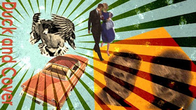
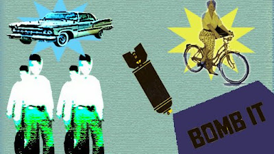
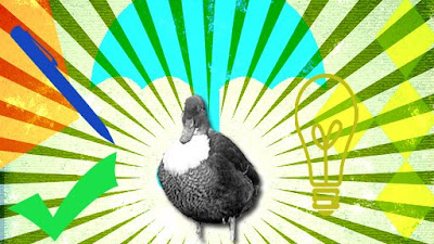
From tutorial week 9 exercise, we learnt about creating a moodboard and Rotoscoping video. The colour of the moodboard is based on the intrinsic colour relationship in a dintinctive image from 1970s. Through my own research of colors used in 1970s which had been displayed in posters and magazines at that time, the colour used was Navy blue or dark blue, yellow, green and orange. I use retro color to represent this video and moodboard. From the recommended reading on the QUT blackboard in one of the articles about colour, it says "color act as lighting which can influence the emotions and moods of the viewers"... They also used particular forms such as line and shapes in compositions. There were many posters using lines that radiates outwards from the centre which indirectly gives a sense of retro and using rounded and sharp-edge shaped as their styles..Therefore i used all these ideas to create and publish my own video, blending them to give 1970s moods/themes...To support these, i used some images include the classic-typed people (identify through their old-fashion hair style) and old-designed bicycle and car to give the audience the feeling back to 1970s. The title of my video work is "Duck and Cover". It emphasized and reinforced audience in 1970s at that time to duck and cover whenever they encountered nearby bomb explosion for their protection.
For video rotoscope as part of this exercise, i have include a body of a person walking and then as he realized there was a bomb explosion, he began to duck(look at my moodboard image 2 . Through the tutorial given by our tutor, i have managed to mask the wanted part successfully. However, when you look at my video closely(related to second moodboard image), i didn't mask it properly where it has jagged around it. One more part that i forgot to add onto my video is the grainy effect or black and white as a style which can possibly identified by the audience as 1970s...I just realized this as i gained more experienced and more experiment using After Effect...as this is part of learning process towards doing my major project for assessment 3, its quite interesting to learn rotoscopic effect and as i gain more knowledge, now managed to point out area that i went wrong during my tutorial exercise in establishing the intended mood and themes to audience.
Friday, May 1, 2009
Saturday, April 25, 2009
By using Adobe PhotoShop i developed this by using my own picture. I make used of tool such as adjustment level to change any color picture to become black with a texture look like ink and layering all pictures taken. For more information how to make, you can go to this website http://www.tutorialseeker.com/forum/index.php?showtopic=2279.
Exercise 2: Create a temporal composition which shows 3 pieces of graffiti being revealed by an animating mask.
The above video shows the composition which contain pictures of graffitis' zooming in and out utilizing the camera tool available in after effect by making it into a layer and manipulating the properties within this layer to allow it magnifies smoothly and panning across the page possible. The camera is one way for making animation easy to develop. By having the composition into a 3D dimension (after we add camera layer), each layered image can be made in such a way that they look like to pop up from the screen by changing the value of the position within their properties. Ok hope you like this video.
Friday, April 24, 2009
Aims and objectives of this week tutorial is to develop a temporal and spatial composition within the constraints of a client brief. a major retailer needs a 20 second retailer for their television campaign. The client stresses that the motion must be CRAZY! CRAZY! CRAZY! The client has certain specific requirements: 3 items with prices need to be promoted within this 20 second spot: Hair dryer $24.99; a Blender $19.99 and a toaster $14.99.
I used scale, rotations and some effect/animation preset to develop the above video and make the colour, fonts and Style to be consistent to show their brand identity. I also added wiggler so that the audience feel the impact how prices has going down crazily and to attract people to come to MAD MACK's store.
WEEK 4: TEMPORAL IDENTITY
Learn Masking Object
In tutorial 4, Our tutor, Keke Robertson taught us how to make masking in After Effect. This involve cutting part of an image by using Pen tool (available tool in After Effect) by tracing the outline of that particular object.
Activity: Temporal identity of a place we have a strong connection with
We were asked to construct a temporal identity for a physical location with which we have a strong connection to. I was doing narrative about Queensland where i stay now which include the brisbane city, the bridge and the beach at Surfer Paradise,Gold Coast. So i combined all these ideas to make footage. I gathered some pictures which are related to Queensland, masked parts of the original pictures by using Pen tool. After masking, then the pictures were layered as well as there're being arranged according to their appropriate position and sequence of images for ease to make transition.
The narrative starts with aeroplane fly over the surfer paradise beach at Gold Coast. When you see the plane closely, It is actually a Brunei plane, a country where i lived before i came to Australia. The first place i went to in Australia was at the surfer paradise beach. The boy appears jumping over the rock represents a local people. which can be seen either at Gold Coast and Brisbane. Thats part of the reason i make the boy figure as a transition. Behind him, you can see a bridge situated above the Brisbane river and then transition move to Brisbane city where i lived. But however the main point for developing this video is to give audiences an idea what is in Queensland. Therefore the target audiences are tourists or travellers.
My tagline is "Queensland, A place to be" . It is fairly short and memorable. It gives the audience a decision that Queensland is a right place to stay and for leisure.
During the week 3 tutorial, we were asked to construct a 2D Composition which develops a temporal and spatial dialogue between animated type and audio. This is to show the relationship between 2D text and digital audio. With reference to the video shown above, i have construct a 30 seconds composition in After Effects and i had animated the text in conjunction to the audio taken from ccmizter done by eight prime, from the creativecommon website (http://www.search.creativecommons.org/).
The composition is 512 width x 288 pixels height with 25 frames per second. The duration is 750 frames equivalent to 30 seconds. The text was animated using the animation presets available in after effect cs3 or cs4. It is simply drag and drop onto the text layer and the properties of this text effects (on the timeline) also allow us to change its durations. .
The narrative of which relationship between the fonts and the audio refered to the detail of the audio itself such as who created the eight prime, when it was published, and it was taken from the creative commons. The rhythm and timing of the audio becomes a guide for the pace of the above animation. Since the dialogue was rehearsed in fast pace, the motions of the texts have been treated in the same way to have a sense of synchronisation between them. I have used simple san serif font which can increase its legibility on the screen but however it doesn't really matter to have any types of fonts for the above footage since the fonts are scale to larger size to fit the composition. After rendering the composition, i just realized some parts are slightly disconnected but however, it is not so obvious. Overall, it is a good start for me as a beginner to do a good job in synchronising and producing relationship between text and audio successfully.
Thursday, April 23, 2009
WEEK 2: TIME, SPACE AND FORM
PART A: Quick intro to Photoshop
Friday, March 13, 2009
About Me
My full name is Md Shamsul Faisal Suhaimi but u all can call me Sam... I am an IT22 student from Queensland university of Technology, Brisbane... Major in Interactive Media... The reason im taking this course is because i want to learn and gain knowledges in all animations and Motion Graphic. I've got experienced in using many programs so far such as Adobe Flash, Adobe Pagemaker, Adobe Dreamweaver (Previously Macromedia), Xara, Programming, etc.. I was working in one of the Multimedia company in Brunei and had been as a trainer for teaching most programs to primary school students in Brunei Darussalam. Furthermore, i worked in DSTCom (Data Stream Technology Communication) as Executive Assistant in Switching Network where i became a software engineer and programmer dealing with mobile networking problem.
About this blog?? Alrite.... My samloveanimation blog contents all the videos which had been created and will be uploaded as my weekly progress for my favourite unit "Animation and Motion Graphic".. This unit is about making animations by using fragment pieces of images, videos, audios and texts (I.e motion graphic), rendered to develop a movie trailer, mtv, advertisements and entertainment. Synchronisation and Temporal aspects of all assets are the requirements in producing the best video with respect to the Narrative which has been made. FYI, I have been using Adobe After Effect CS3 to develop and renders the animated video... In each video, there are a certain number of comments accordingly and their limitations.
Thank you for visiting my blog. Have fun will all the videos i have uploaded here... i will try to update this blog from time to time.. Cheers :)


